FixMyFlyerSale
Sale flyers that don't look AI
Sale flyers are where AI design goes worst: starbursts, three exclamation marks and a fake product photo. Restraint reads as a better shop.
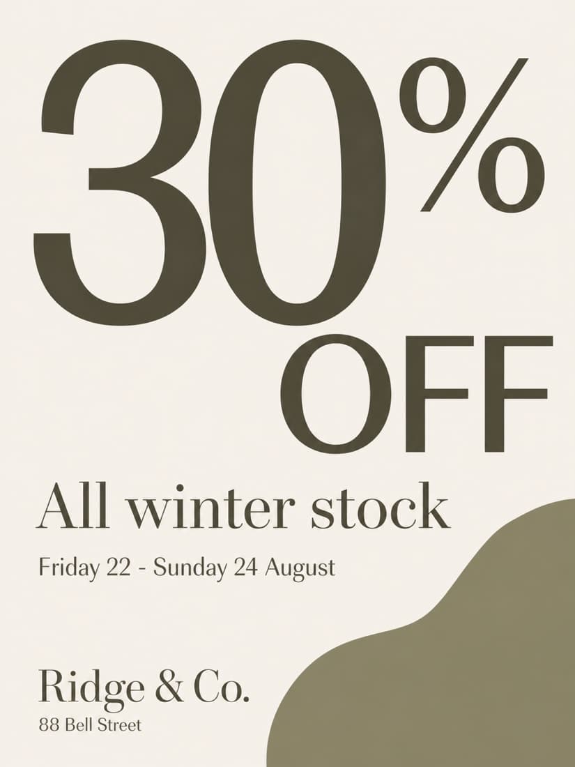
What makes a good one
- 01One number, huge. The discount is the headline.
- 02Say what's actually on sale — "everything" is less persuasive than "all outerwear".
- 03Put the end date on it. Urgency beats decoration.
The words on the example
30% OFF
All winter stock
Friday 22 - Sunday 24 August
Ridge & Co.
88 Bell Street
Those exact lines went in and came out unchanged. That’s the part most AI flyers get wrong — they rewrite your details, or invent new ones. Here’s the prompt we used, free, if you’d rather do it yourself.