FixMyFlyerChurch event
Church event flyers that don't look AI
Church flyers get the AI treatment more than almost anything else, and they're the ones where it lands worst — the whole point is that a real community made it.
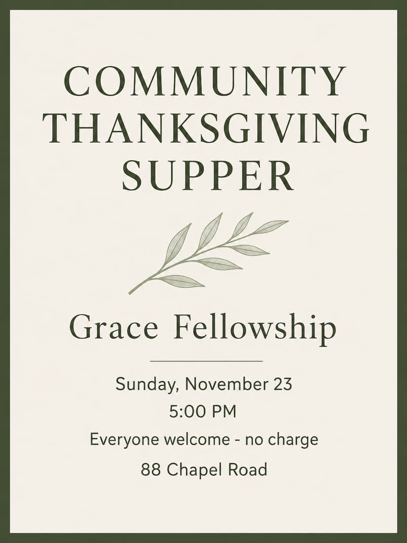
What makes a good one
- 01Calm and generous beats dramatic. Nightclub energy is the wrong register.
- 02Classical type — a real serif — carries warmth that a display font can't.
- 03Never generate images of congregants. Use type and space instead.
The words on the example
COMMUNITY THANKSGIVING SUPPER
Grace Fellowship
Sunday, November 23
5:00 PM
Everyone welcome - no charge
88 Chapel Road
Those exact lines went in and came out unchanged. That’s the part most AI flyers get wrong — they rewrite your details, or invent new ones. Here’s the prompt we used, free, if you’d rather do it yourself.