The flyer prompt
that doesn’t
look AI.
This is the actual prompt our renderer runs — not a simplified version of it. Copy it, paste it into ChatGPT or whatever you use, and replace the bracketed parts with your event.
Design an event flyer from scratch, the way a skilled human graphic designer at a boutique studio would: a clean modern layout with generous whitespace, a restrained palette of at most three colours, strong typographic hierarchy using real typefaces, and at most one simple tasteful graphic element. No neon glow, no gradients, no icon boxes, no arrows, no checkmarks, no starbursts, no clutter, no 3D chrome objects, no stock-looking AI imagery. A flat, print-quality graphic design poster of the kind a design-conscious venue would actually print — not a photograph, not 3D, and nothing that looks AI-generated.

The flyer must contain exactly this text, letter for letter, and no other text:
[YOUR EVENT NAME]
[VENUE]
[DAY, DATE]
[TIME]
[PRICE / ENTRY]
[ADDRESS]

The design should suit [ONE LINE ON THE MOOD OF YOUR EVENT]. Set [THE MOST IMPORTANT LINE] as the dominant element and let one simple graphic idea carry the rest.
Same event, two prompts
Both of these came out of the same image model, minutes apart, for the same made-up gig. The only thing that changed was the prompt.
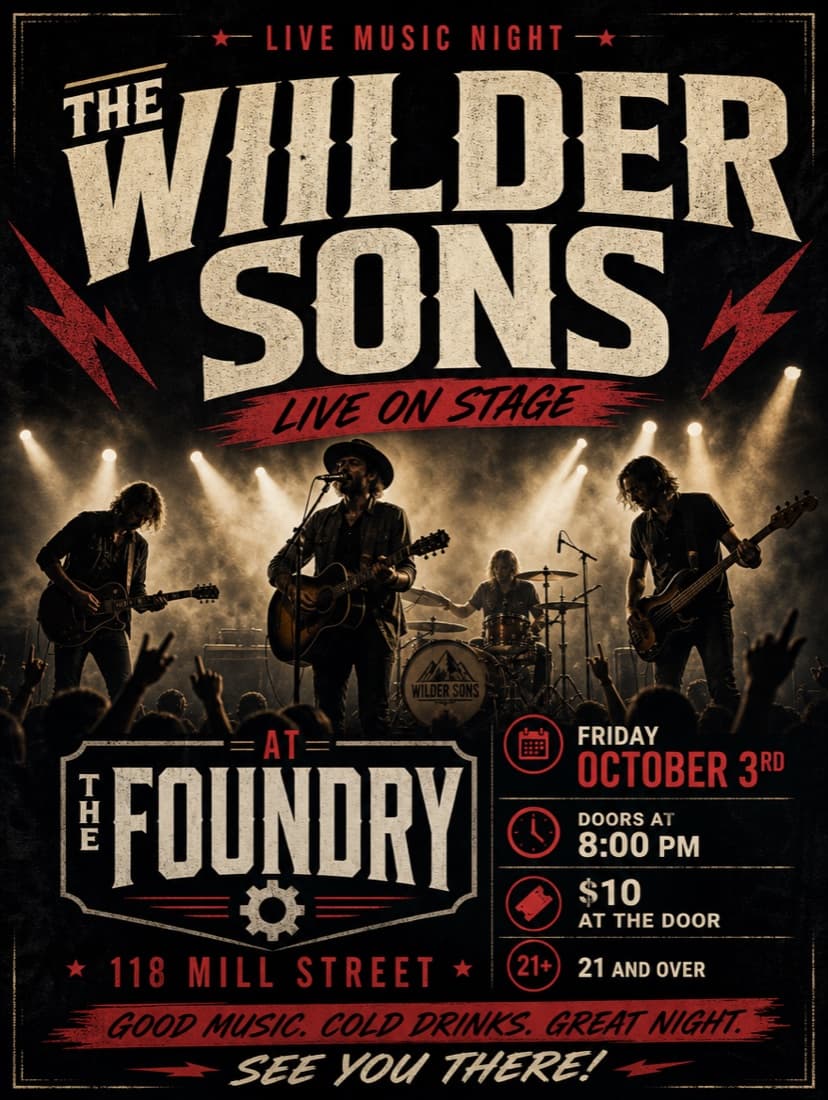
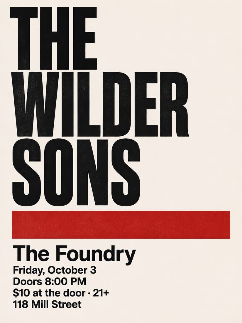
The prompt we used on the left
Create an eye-catching, professional event flyer for a live music night. The event is "THE WILDER SONS" playing at The Foundry on Friday, October 3rd, doors at 8:00 PM, $10 at the door, 21 and over, at 118 Mill Street. Make it look modern and exciting so people want to come.
What the ordinary prompt did wrong
- Invented four lines nobody asked for — “LIVE ON STAGE”, “GOOD MUSIC. COLD DRINKS. GREAT NIGHT.”, “SEE YOU THERE!”
- Misspelled the band as “THE WIILDER SONS”
- The row of little icon boxes — calendar, clock, ticket, 21+
- A stock-looking photo of a band that doesn't exist
- Distressed dark texture and the same red-on-black everyone else has
Worth dwelling on the misspelling: nobody typed “WIILDER”. Image models reconstruct letterforms rather than setting type, so the longer and more decorative the words, the likelier one comes out wrong. Always read every character on a flyer before you print it.
Why it works — the six moves
- 01
List your text and forbid the rest
The single highest-leverage line is “must contain exactly this text, letter for letter, and no other text.” Without it the model writes its own filler — taglines, “SEE YOU THERE!”, invented hashtags — because it has learned that flyers have lots of words on them.
- 02
Name the specific tells you don't want
“Make it professional” means nothing to an image model. “No neon glow, no gradients, no icon boxes, no arrows, no checkmarks, no starbursts” names the exact defaults that make a flyer read as AI, and blocks them individually.
- 03
Cap the palette
At most three colours is the fastest route from amateur to designed. The AI look is partly just too many colours competing at once.
- 04
Ask for whitespace out loud
Left alone, image models fill every corner. Saying “generous whitespace” gives the model permission to leave space, and space is most of what makes a layout look intentional.
- 05
Allow exactly one graphic element
One simple object or motif reads as a design decision. Five reads as clip art. Cap it at one and say it should be tasteful and simple.
- 06
Say what it should be, not just what it shouldn't
End with the positive target — “a flat, print-quality graphic design poster the kind a design-conscious venue would actually print”. Image models steer toward what you describe far better than away from what you ban.
Swap in your occasion
Replace the last paragraph of the prompt with whichever of these fits. It’s the line that decides the mood.
- Live music
- The design should suit a small, sweaty rock show at an independent venue. Set the band name as the dominant element and let one heavy rule or geometric block carry the rest.
- Birthday party
- The design should suit a warm, playful birthday party among friends. Let the name and the age dominate, and keep everything else quiet underneath.
- Car meet
- The design should suit an early-morning cars and coffee meet for enthusiasts. One clean line drawing of a single car is plenty — no photography.
- Fundraiser
- The design should suit a community fundraiser that needs to feel trustworthy rather than loud. Lead with the cause, keep the palette sober, and give the details room.
- Grand opening
- The design should suit a new independent shop opening its doors. Confident type, one bold colour, and nothing that looks like a discount banner.
- Church event
- The design should suit a welcoming church gathering. Calm, generous spacing and a classical typographic feel; avoid anything that reads as a nightclub flyer.
- Block party
- The design should suit a neighbourhood block party on a summer afternoon. Friendly and bold, one simple motif, nothing corporate.
- Sports night
- The design should suit a bar hosting a big game. High contrast and punchy type, but no stadium photography and no team logos.
Or don’t prompt at all
The prompt gets you most of the way, but you’ll still be re-rolling until the text comes out right. Type your details into us instead and we run it, check the words, and hand you two finished designs for $2.99.